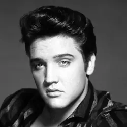
 Elvis Presley
No sooner had Taylor Swift unveiled imagery of her October-due The Life Of A Showgirl to 15 million podcast viewers, than Kylie Minogue fans were in arms.
They insisted it seemed a rip-off from the feathers, sequins and headgear from the Aussie singer’s Showgirl Tour in 2005.
Minogue calmed the waters, saying, “Showgirl life is ‘a thing’, multi dimensional and so much more than feathers and dazzle. Respect and admiration to all my fellow hard working Showgirls.”
Of course Minogue wasn’t the first with that look: Cher, Tina Turner, Christina Aguilera and Beyoncé were some who opted for that showgirls theme and imagery.
But let’s look at five album covers that were also accused of poppin’ tags.
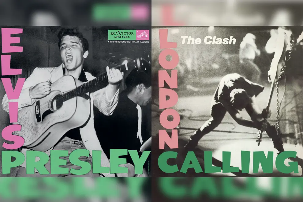
The Clash vs. Elvis Presley
When The Clash’s double album London Calling came out in 1980, there was murmuring it pinched from Elvis Presley’s debut album in 1956.
They both had blurred black and white shots of someone with a guitar, with the same stylised pink letters down the left side and green text across the bottom.
Of course the covers look alike, you bloody fools, The Clash snarled. It was our tribute to the first rock rebel, a sexual young 20-year-old unleashing a rage shaking up the world.
The Presley shot was uncredited for decades. It was taken by William Vernon “Red” Robertson of Tampa, Florida.
Elvis had travelled from his home in Memphis to Tampa to open the bill at Fort Homer Hesterly Armory at 5pm on July 31st, 1955.
His manager Colonel Tom Parker hired Robertson to take a series of shots. The original of that famous shot was full length, showing the Pelvis with legs apart flanked by guitarist Scotty Moore and bassist Bill Black.
Parker zeroed in on that shot. At the time Elvis’ hip shaking was considered so obscene that his TV appearances were shot waist-up.
Don't miss a beat with our FREE daily newsletter
The manager had no problems with cropping the shot: the joyful in-the-moment expression on his face was more sensual than anything his hips were suggesting.
The photo was already used as a press shot before RCA Records used it on the album.
Fast forward to September 20th, 1970. The Clash were playing the Palladium in New York City. In the UK, they were used to the crowds going crazy. At this show, bouncers kept audience members on their seats.
Frustrated, bassist Paul Simonon smashed up his Fender Precision Bass guitar on the Palladium stage. The time was 9:50pm: his watch broke when the blows began.
The great shot was captured by rock photographer Penny Smith. She was moving back from the stage to avoid being hit by guitar splinters. As a result, the photo was blurry, and Smith initially didn’t want it used.
But The Clash singer Joe Strummer and graphic designer Ray Lowry decided it’d make an awesome cover, and agreed to use the look of the Presley long player artwork.
Simonon made the link in Rolling Stone: “When the Elvis record came out, rock & roll was pretty dangerous, and I supposed when we brought out our record, it was dangerous stuff, too.”
Q Magazine later lauded the Smith shot as the greatest rock photo of all time.
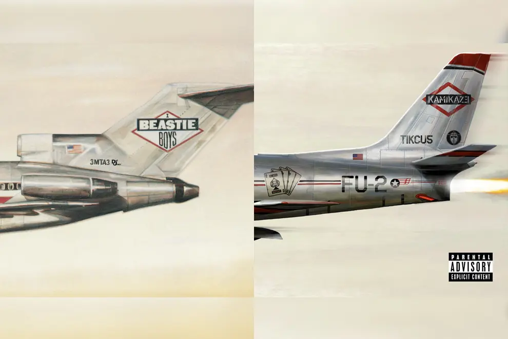
Beastie Boys vs. Eminem
The cover of the Beastie Boys’ Licence To Ill (Nov. 1986) portrayed an American Airlines Boeing 727 with logos of the band and its record company Def Jam.
It’s crashed into a mountain, crumpling into what looks like a spent reefer.
The tail also had registration number '3MTA3' which spells 'EATME' when viewed in a mirror.
It was the album’s producer Rick Rubin who came up with the cover concept, after reading the Led Zeppelin biography Hammer Of The Gods and its stories of excess, and which included photos of Zep’s private touring jet.
It was an apt link: Rubin combined Zeppelin’s metal riffs with hip hop beats, making Licence To Ill one of the first to build a bridge between the two styles.
Rubin said in the book 100 Best Album Covers, “I wanted to embrace and somehow distinguish, in a sarcastic way, the larger than life rock & roll lifestyle.”
The artwork was created by Stephen Byram and World B. Omes (aka David Gamble) to emphasise the Beasties’ subversive style.
The concept was repeated on Eminem’s Kamikaze (2018). It has an image of fighter pilot LT. Mathers III crashing an F-86 Sabre fighter jet into an object. Other similarities included use of a number on the plane (“FU-2”) and mirror writing “Tikcu5.”
Eminem said his cover was a dedication to Licensed To Ill and to the Beasties, whom he has repeatedly confirmed as an influence on him, for their “fuck you” attitude, like his own.
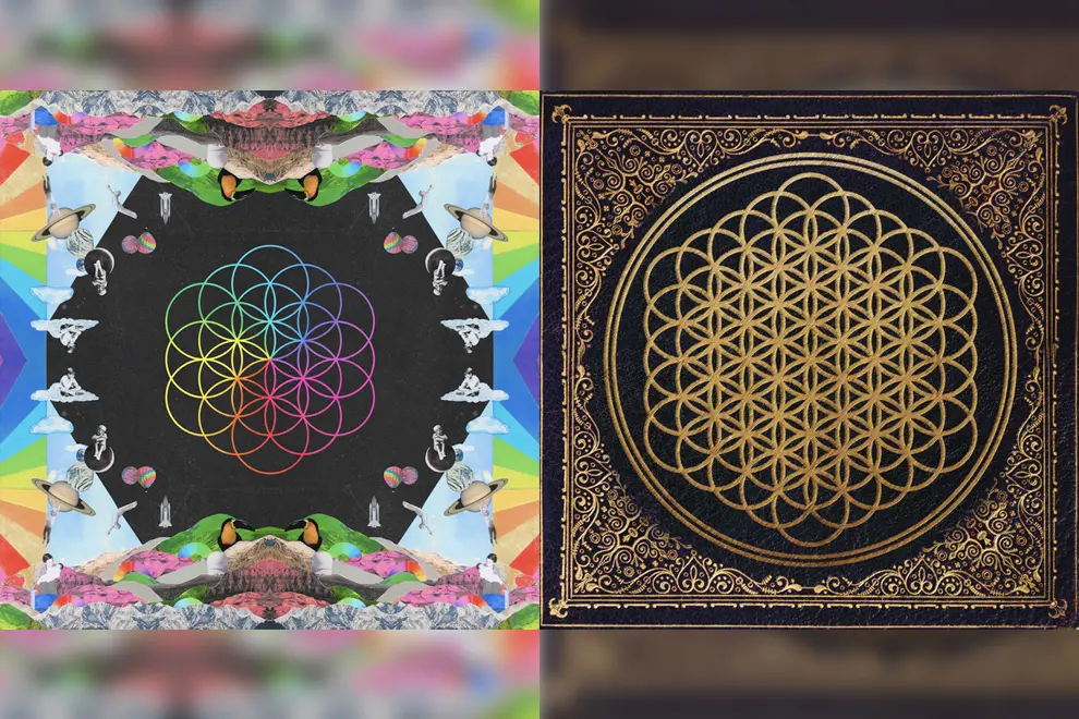
Bring Me The Horizon vs. Coldplay
Chris Martin’s habit of fasting up to 30 hours each week because “Your brain becomes very lucid about ideas” worked on Coldplay's seventh album A Head Full Of Dreams (2015).
To him, the body’s sense of gratitude when it starts to eat again gave the album a joy about life and music. The themes slowly uncovered like a flower, inspiring part of the cover.
Created by the band and Argentinean artist Pilar Zeta, she got the band members to come up with a large mixed media montage of children's paintings (their own and those of their children) with the flower of knowledge at the centre.
She said in an interview with Coldplay’s official website, “Guy had this huge box with really awesome old photos that he was cutting out. And Chris would come and he would do a painting and then we'd try to include it in the collage, or he would come and paint a bit of the collage.
“So it was like a mix of things. And then all of a sudden, a week later we have this huge collage done...I didn't do a mock-up of how the collage would look. It was just organic.”
After comments in social media by Bring Me The Horizon fans of its similarity to its Sempiternal album from two years before, the Sheffield band’s Oli Sykes claimed there was a similarity.
But Sykes soon changed his mind, saying both covers used the "flower of life" universal symbol.
Sempiterna, named after an ancient English word for everlasting time that can never come to pass, also had themes of joy, colours and hope, after the band came into the spotlight after a period in the dark.
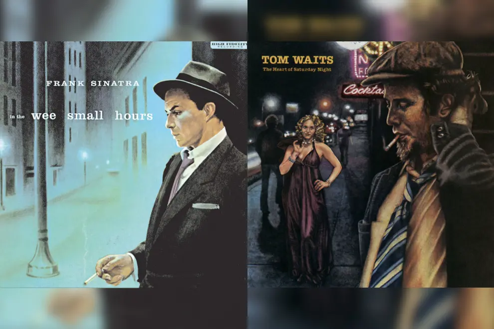
Tom Waits vs. Frank Sinatra
Only a few singers have the tone and the style to deliver albums that catch the exact vibano of those moments between the darkest of the night and the first light of dawn.
These are usually expressed through the characters of night people to convey regret, failed relationships and depression.
Frank Sinatra’s classic In The Wee Small Hours came in 1955, and Tom Waits’ The Heart Of Saturday Night in 1974 were two such records.
If there was a connection, it can be explained by a comment Waits made: “I didn’t really identify with the music of my own generation. But I was very curious about the music of others.”
On Sinatra’s album cover, Ole’ Blue Eyes was standing alone in a deserted street under blue-tinged street lights. One writer described the artwork as “reminiscent of film noir poster art and hardboiled/pulp fiction book covers.”
Waits regarded In The Wee Small Hours one of his favourite records. The Heart Of Saturday Night has a similar mood, and so does the cover art which is again clearly a tribute.
A tired Waits was seen leaving – again alone – a neon-lit cocktail lounge into a grey street observed by a blonde woman. He was probably singing any of the album’s tracks like Drunk On The Moon or The Ghosts Of Saturday Night.
But the Waits cover has the design of the groundbreaking Cal Schenkel, an American artist who emerged in the late ‘60s and created covers that had abstract notions of the various identities and absurdist humour of visionaries like Frank Zappa and Captain Beefheart.
Schenkel had the style which allowed fans to create their own imagery. With the Waits cover, it began as a specification to pay tribute to Sinatra’s but took it to a different era and style.
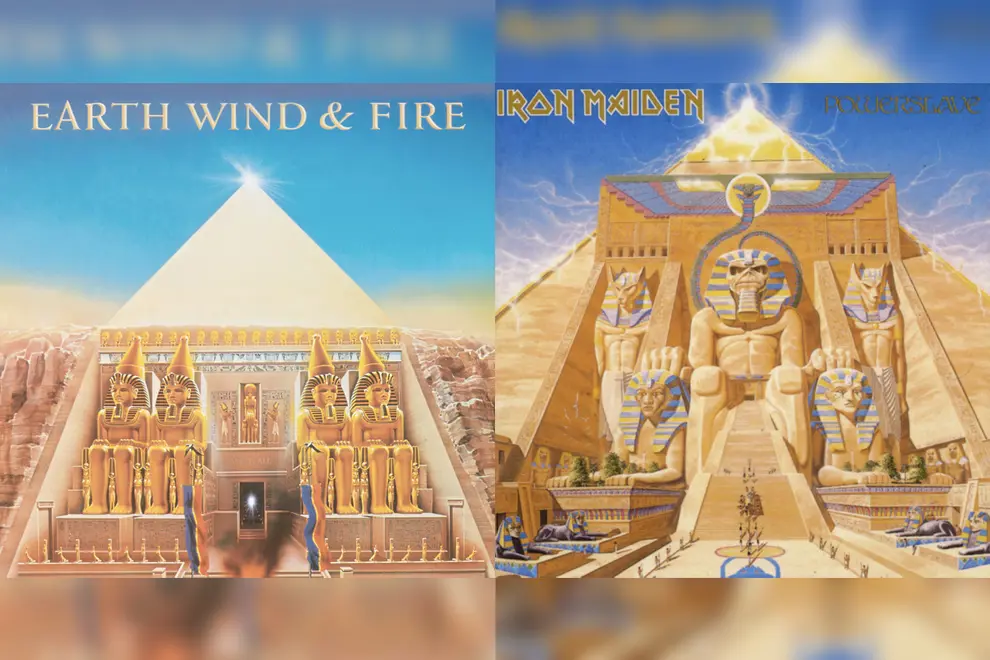
Earth Wind & Fire vs. Iron Maiden
Earth, Wind & Fire (EWF) came out of Chicago in the late ‘60s led by the far-sighted Maurie White.
The band’s name came from elements of his astrological sign Sagittarius. The music spanned jazz, R&B, soul, funk, disco, pop, Latin and Afro-pop, making them one of the biggest bands of the time, selling over 70 million albums.
The band’s visuals and cover art were also by White who wrote the songs. He drew from religious, spiritual and Afrikan Kemitic symbols to form the imagery.
The All 'n All (1977) album was written and conceived after a month-long visit by White of Argentina and Brazil. The title was used by some Muslims as a term meaning “Allah”.
The record marked a new era for the US outfit, and the album cover was part of their resulting world tour’s stage production designed by famed Broadway designer George Faison, costumes and magic effects.
The cover art was based around a temple in Ancient Egypt complete with pyramid. According to bassplayer Verdine White, “We wanted to do something that relates to what we regard as our primitive heritage.”
At the same time, he stressed, “We want to have our music reflect the urgency of contemporary music, it’s got to be relevant to today.
“At the same time, we’re about being innovative, creative and bringing up the general level of concerts so that when people pay their money, they get a good show.”
In 1984, Iron Maiden emerged with Powerslave, with an Egyptian theme, on the cover artwork and the stage production on the extensive world tour that followed.
The title track was written by singer Bruce Dickinson, mostly from the viewpoint of an Egyptian pharaoh considered a god by his people and wondering why he had to die.
The song was also about Dickinson’s own life as a rock god, and his continued fascination with loud music and crowd responses.
The artwork was by Maiden’s long time designer Derek Riggs. He sneaked in little gems as scribbling as “Indiana Jones was here 1941”, “bollocks” written in hieroglyphics, and a picture of Mickey Mouse for fans to discover.
Riggs got prickly when accused of ripping off the EWF cover.
“That's just crap. Because of the song Bruce wrote it had to be Egyptian, so I went back to the tomb of Rameses 2 and copied the idea from that (just like Earth, Wind & Fire did) but mine is better.
“It's also got a hieroglyph Micky mouse in the bottom left corner. Ha! Earth Wind and Fire don't have a Mickey Mouse. Obviously inferior."